The Matching Solids of Flower Pot Fabric
Everybody always asks for the coordinates for fabric collections. Today, I’m popping in to deliver a quick list of matches to my upcoming Flower Pot fabric collection for Moda Fabrics (April 2022). Sure is a warm and cozy group.
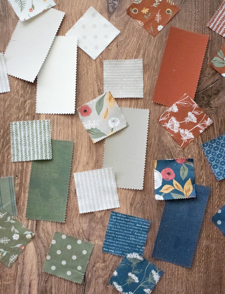
Sourcing the Matches for our Flower Pot Fabric Collection
In the early stages of designing a fabric collection, my first step is to come up with master colors. I always check Moda’s Bella Solids first to see if they have what I’m looking for. Unfortunately, there aren’t always matches for what I have in mind. Sometimes I need to supply paint chips or even a color printout to Moda to achieve the colors I’m looking for.
For this reason, I always add near-solid prints in all of my collections. Of course, these coordinate perfectly while adding something a little ‘extra’ (i.e. a polka dot or other simple pattern) to it, making it a fun background or accent. Even so, I try to come up with a list of any solids or near-solid basics I know of. I pull from Moda’s catalog of Bella Solids, as well as Grunge basics by BasicGrey.
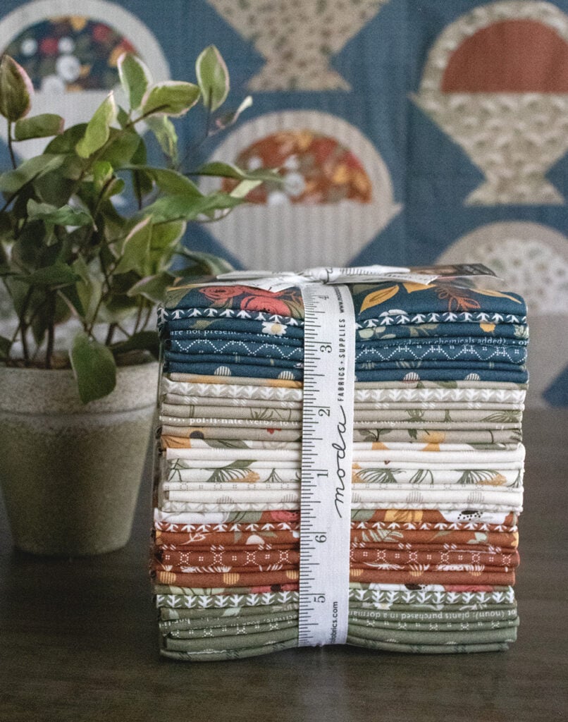
Moda Bella Solids
Here’s what I found to be the best matches this time around. I couldn’t find a navy or green that was close enough to my liking. (It’s possible another manufacturer has a close match and I don’t know about it.)
- 9900 285 “Unbleached”
- 9900 178 “Etchings Stone”
- 9900 310 “Taupe”
- 9900 105 “Rust”
BasicGrey Grunges
Since there aren’t navy or green Bella Solid matches, I found a couple Grunges that fit in nicely. I’ve also listed a gold color that complements the gold accents seen in many of the collection prints.
- 30150 57 “Juniper” green
- 30150 175 “Picnic” navy
- 30150 115 “Elafin” golden yellow
Flower Pot Colorways
Here’s a closer look at each colorway of the Flower Pot collection. This will give you a good idea of what prints exist and may be suitable for the backgrounds or accents you could use that already exist in the collection.
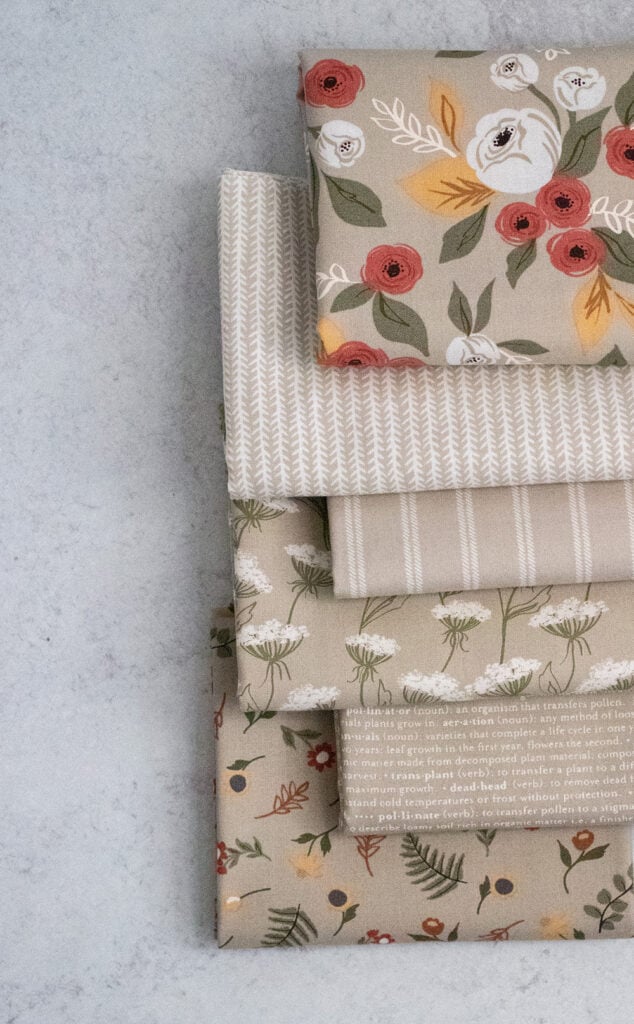
Taupe
Always the perfect neutral, this taupe colorway will steal your heart. They made for the perfect baskets in the Gather quilt – check out version 1 (navy background) or version 2 (cream background) here to see them really shine.
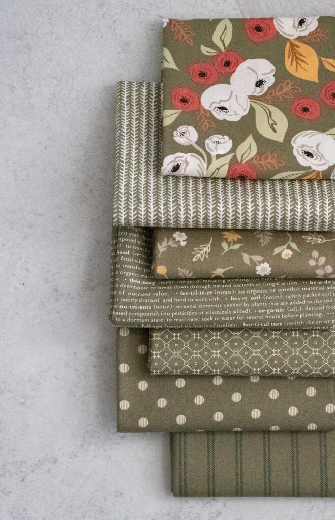
Flower Pot Fabric Sage
This muted olive green is really an essential for any garden quilt. You’ll see many of these prints make an appearance in leaf/stems. I just have to single out the “Garden Stripe” print as one of my favorite bindings in the group. Keep an eye out for a lot of this colorway in the Flourish quilt samples.
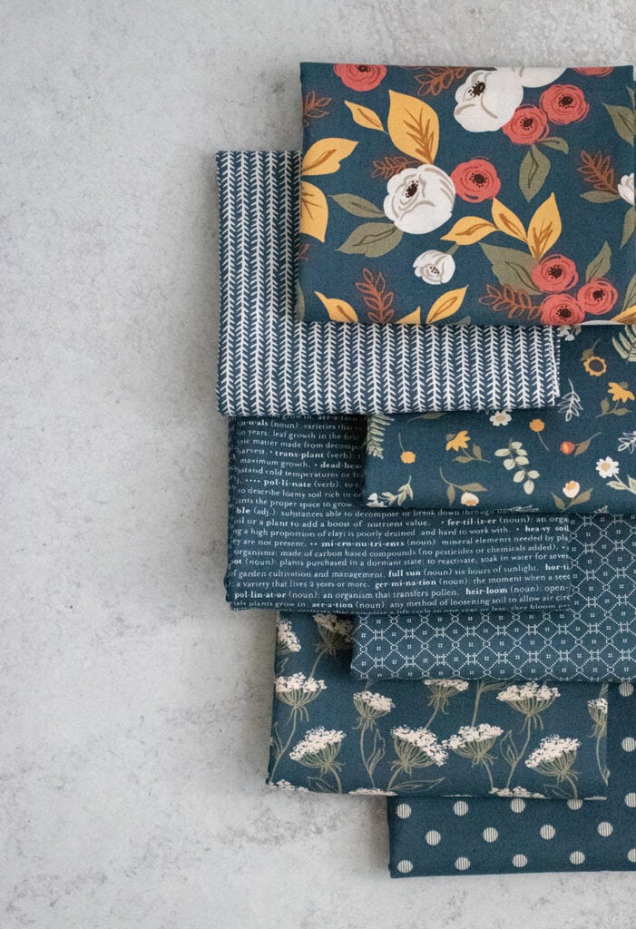
Navy
This is always a popular colorway in my collections. I want to point out a couple of the prints that I used in quilt backgrounds. There’s the dainty “Glossary” text print that is found in the Flourish quilt. And don’t forget the “Mosaic Tile” below it – used in one of the Gather basket quilts. What really makes me swoon is the “Queen Anne’s Meadow” print on top.
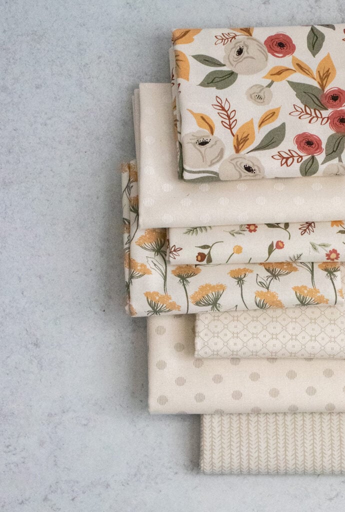
Ivory
This colorway offers a lot of great background basics. In particular, the tonal and taupe “Garden Dots’ on the ivory background, as well as the “Delicate Tile” print (5th down from the top). These prints always sell out the quickest -so- if you are hoping to get some in April, now is the time to contact your favorite local or online shop to let them know.
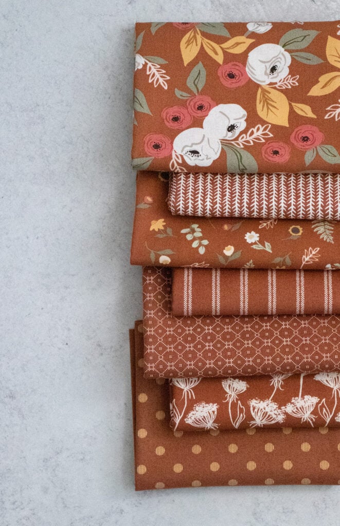
Clay
This one is giving me the pumpkin spice vibes right now. It’s a lovely addition to the collection and adds a lot of warmth through the pops of gold.
I hope you enjoyed this update on my Flower Pot fabric. Do you have a favorite colorway? Let me know in the comments!
Like this post? Drop your email in the box below to get new post notifications via email.
Leave a Reply
You must be logged in to post a comment.

12 Comments
Verna Van der Zel
October 25, 2021 at 4:30 amI love Taupe and Ivory!
Mary Ann Gill
October 25, 2021 at 7:33 amI love navy and ivory. Beautiful fabric. I like the text print.
Patty Fowl
October 25, 2021 at 8:53 amLoving those beautiful ivories!!
Susan Salo
October 25, 2021 at 10:59 amI think the clay is really striking. Great for a Flower Pot!
Sheila Clark
October 25, 2021 at 11:13 amBeautiful fabrics
Jerri D Wedam
October 25, 2021 at 1:33 pmGreen is my favorite color. I have been looking a very long time to find the colors I like to make a green quilt. Bingo!
Stephanie Wild
October 25, 2021 at 6:49 pmI like all the colors. They all go so beautifully together.
Kay Romahn
October 25, 2021 at 7:45 pmMy favorite color way is Clay, followed closely by Navy. They are all beautiful!
craftingaplannedlife
October 26, 2021 at 10:29 amThis is an amazing collection! The colors are all beautiful!
Sharon Lagace
October 27, 2021 at 6:30 amClay and Sage are my favorites. I love them all! I cannot wait to get my one yard bundle of Flower Pot!
Pam
October 27, 2021 at 6:40 amHard to decide but love the blue color way
Denise Gimarc
August 28, 2022 at 1:50 pmVanessa, I really love Flower Pot. Do you think this collection would look good using your Hubba Hubba pattern? I’m making matching twin quilts and would like to highlight the larger flower prints in the different color ways.